unafor visual identity
CASE STUDY
Visual Identity
logo
branding
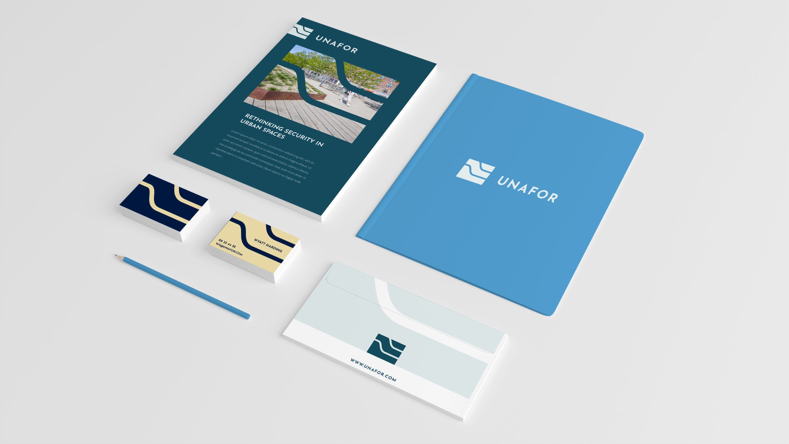
About the client
Milford design and retail solutions for anti-terror securing urban areas. They design beautiful planters, benches and other elements typically used when designing an urban area. They wanted to take these products and retail them through a sub-brand. WIISUEL was approached because they needed help with designing the brand identity, including naming the new brand.
About the brand
The first step was to interview them about their new sub-brand. The client knows their product, and it’s important to listen, ask and explore all you can before developing anything. We discussed the brand, the product, their ideas of how they wanted to be perceived, what they wanted to communicate. We then looked at the prepared mood boards, with colors and styles, again to understand what they resonated with.
The next step was to gather all points from the meeting and make concepts, that try to embody some of the things discussed. With the concepts we explored different directions, and finally settled on a singular concept which we developed further.
Keywords
free of worry // joy // scandinavian design
client love
“I found collaborating with you and WIISUEL very easy as there was a clear plan of what was expected at each stage of the project. This meant there was no misunderstanding. Communication was also very easy as I found you receptive to our views and the background of the company.”
Wyatt Harding
CEO, Unafor
Inspiration
Exploring the shapes of their designs, there is a structured yet organic curvature to the lines of their designs. I was inspired by this for one of the concepts (which was the one they ended up going with.
the logo as a Concept
The final result was a rectangle with 3 layers – the grid was evengly spaced so that the curves could still seem sharp, and almost engineered. The shape symbolizes the fusion between the organic design disguised in highly functional engineering. From above, the layers almost give the idea of a road going between creatively shaped benches or planters, much like the design of their urban spaces. The layers could also be a nod to the technology of the safety urban installations, since they go several meters underground, giving both value to the pedestrians and to the safety of our city – multidimensional value.
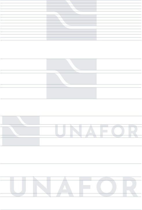
building the brand
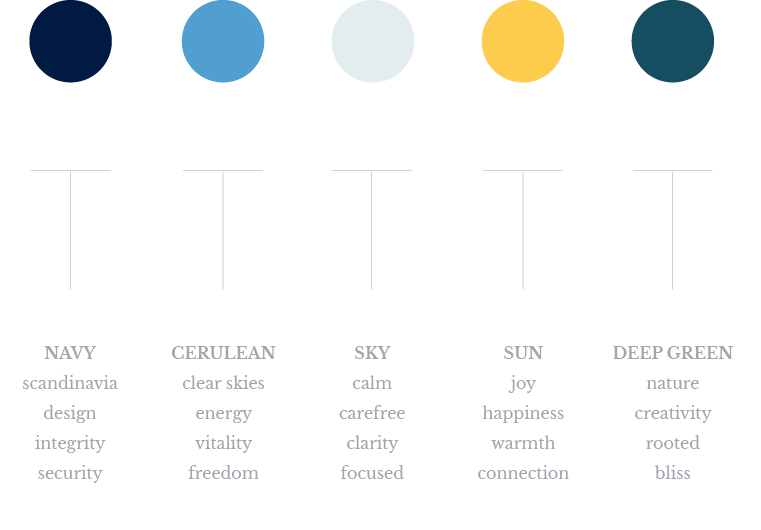
The colors were carefully chosen to carry the desired messaging as well. They wanted to differentiate themselves, by going away from the hardcore almost military-style tone of the urban safety industry. They wanted to focus less on fear and safety from danger, and more of the feeling you have, when you are without worry – they described ‘a sunny evening, sitting on the benches, watching the buzzing city, children playing, having a drink – no worries, just enjoying the moment and the space’.
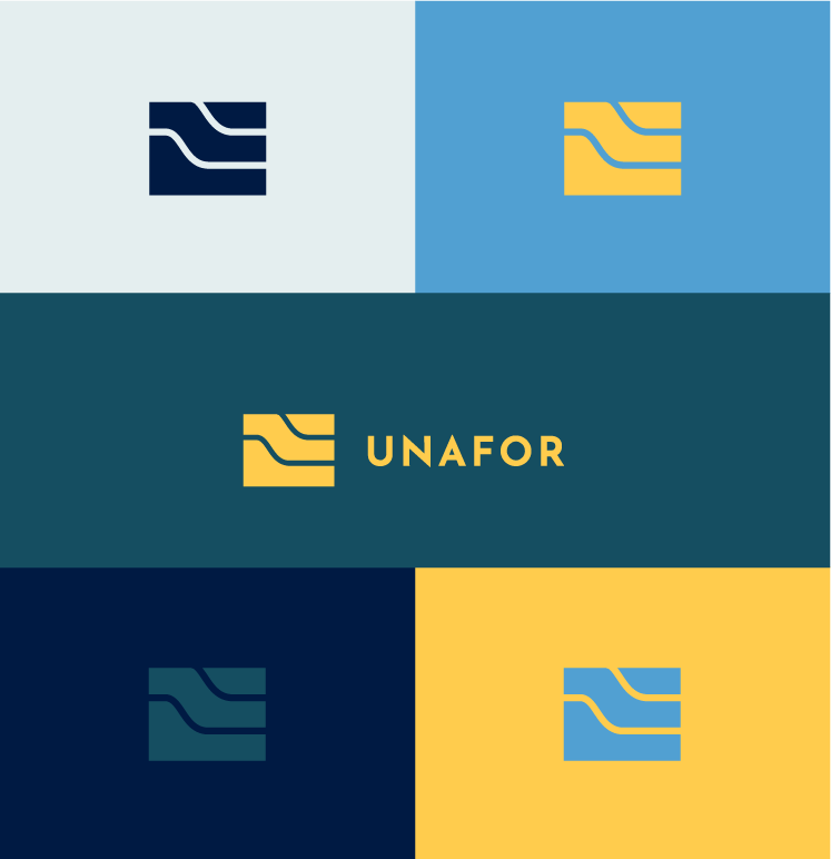

Expressing the brand through colors
Below you can see the different colors chosen for the palette, and what associations are connected to them, to express several of the ideas and emotions connected to the brand.
Did this spark your curiosity? You can either read more about our services, specifically visual identities, or you can take contact.