Bondegårdsferie visual identity redesign
CASE STUDY
Visual Identity
logo
branding

About the client
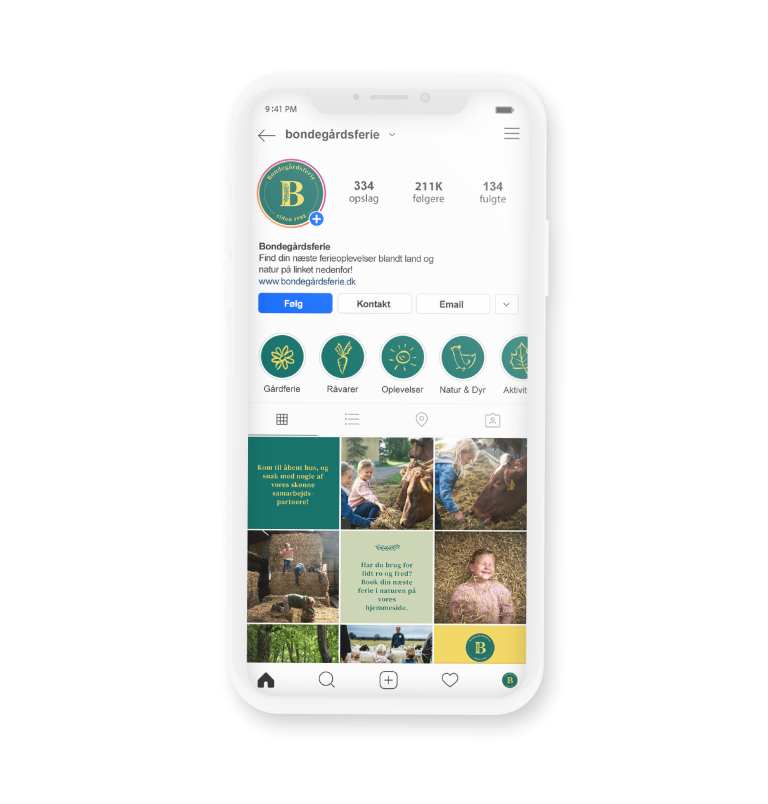
Bondegårdsferie (translates to ‘Farm Holidays’) is a brand of a Danish union for farm owners, who offer stays and/or activities in the countryside of Denmark. They had just developed a new communication strategy, that pointed out the desire to be increasingly active on social media, and to cater to a younger audience. With this, they wanted to update their visual expression, and explore new ways of branding themselves. They already had a website with a complete overview of the farms and activities, and also wanted a draft of the website in the style of the new identity for the website developer to work from.
About the brand
The union have their own official title, but the concept of showcasing the farms has always had other names – however it varied across platforms. The initial discussion was on the name, and streamlining the brand across platforms.
Keywords
nature // calm // joyful experiences // history // integrity
client love
“We have collaborated with WIISUEL on renewing the layout on the website, Facebook and Instagram as well as a new logo for our association. We have experienced the collaboration as very result-oriented and creative. Christine is not afraid to go down untraditional paths while maintaining a good sense of what we wanted to include in the association’s new expression.”
Bjarne boesen
ChaiRman, bondegårdsferie
Inspiration
An updated visual expression can potentially increase the trust in the brand as it implicitly communicates that the organization stays up to date and is determined to refine its brand. The visual expression is the first thing the customer encounters and is therefore also the first impression the customer gets.
This presents a golden opportunity to increase the strength of the association’s channels by using a new visual identity to bring the visual identity into the era where the platform it will act on was created. This can be done in many ways, everything relies on the messaging and tone of the people they wish to address (visiting guests, members and potential new members).

Negotiating our way to the final result
Early on in the process it was clear that the outcome of the visual identity should be the balance between: classic – yet modern. Polished – yet personal. Soothing – yet exciting.
This is not always the easiest tight ropes to walk on, and this balance can be different from person to person. The client needed to feel safe with the final outcome, while being pushed to explore new sides of themselves. The colors and fonts were the first to find their place, but the logo was and style of the visual expression had two concepts that were tested and discussed to the end of the process.
It’s important to understand that developing a new identity, developing a brand, is just as emotionally charged as any other activity in the company. It’s a negotiating process, where the entire fabric of the organization suddenly gets pulled into the light. What begins with ‘just a logo’ ends up being ‘who are we, and what do we stand for’. As a designer, navigating and facilitating this process, is as important as the rest of the work.


Did this spark your curiosity? You can either read more about our services, specifically visual identities or brand assets, or you can take contact.